Saw this interesting tweet a few days ago. I think it beautifully distills how software development is changing. Both the content and the origin of the retweet tells a story about were the world is heading.
API’s and cloud platforms have been around for a while, but it has taken time for the potential to catch on more widely among business managers outside tech.
The high quality and easy-to-use API’s now available with most modern solutions gives unprecedented possibility of tying information and processes together with ease. In turn, this creates a possibility to easily build meaningful applications that run on top of a cloud platform. The constantly increasing possibilites in Microsoft Power Apps is an obvious example. New connectors are made available frequently and in addition you can create your own custom connection to a REST API.
Once you introduce Power Apps to your organization, you’ll hopefully (or rather, probably) get flooded with proposals on other things that could be solved with a Power App. Rather than answering those proposals with “maybe’s” and “in due time”, wouldn’t it be great to direct the newly enthused Power App converts to a Power App environment that urges them to think a little more about what they want to accomplish. And gives you an opportunity to share and prioritize all the ideas you get.
Microsoft launched a tool to keep track of your innovation ideas, called Innovation Backlog, which launched on January 14th. It works either as a standalone application, or integrated in Teams via Dataverse for Teams.
As I tested out installing the Teams-integration to check it out, following the Microsoft documentation. The installation was more cumbersome than clicking a few buttons, but as a method to unpack and configure a solution within Teams, I’m very impressed.
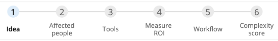
The user is prompted to enter six steps for the idea, covering a high-level description of the idea, the people and the tools involved, the benefit of solving the problem, the proposed workflow, and the a module to calculate the complexity of the solution.
Six steps for the user to enter
And it’s a smooth ride. You can upload workload schemas from e.g. Visio, or create them within the app, which seems pretty nifty. It has a lot of great default values for the user to choose from when calculating the ROI.
Some of the UX leaves a bit to ask for, like how it was hard to find the other categories than Time for ROI measures, and like how the button text next to the icons are not clickable.
But generally, the application gave me quite a few “I wonder how they did that!”-experiences, for example having collapsible galleries that could be really useful.
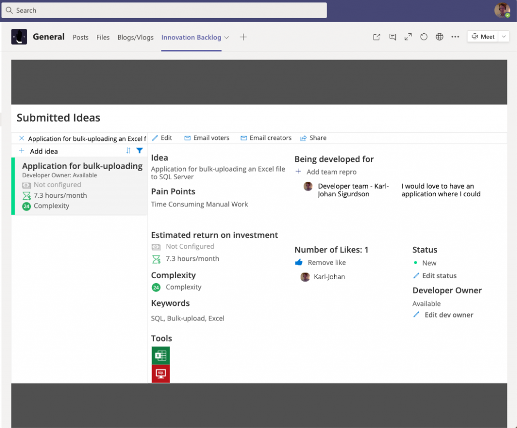
What it looked like when I submitted my idea for a bulk-uploading tool to SQL.
When it comes to the usefulness of the tool, it demands pretty sophisticated input users, with a pretty sophisticated idea. Some PMO organizations implement this kind of tool for exactly that purpose: to prune out unrealistic or unrefined ideas by raising the threshold too high, and that might be a good idea if you have too many good ideas.
The downside, however, is that you’d likely exclude some really good and really impactful ideas. I believe that the power of low-code tools like the Power Platform really lies in the accessibility to all ranks in the organization, and it’s likely to have the greatest impact in areas that do not have a sophisticated process-design thinking. To demand that level of refinement in order to hear an idea, is likely to exclude too many good ideas.
So my suggestion is to remove the workflow-input, and have the PMO (or whoever is doing the prioritization) evaluate that after the initial selection has been made.
Calculating ROIs in order to support prioritization of ideas seems like a great idea on paper. We should only do the things that have a high enough ROI, and we should do the projects with the best yield first.
But just looking at the wide range of suggested benefit alternatives in the app clearly paints the picture that you are not comparing apples to apples. A way to circumvent that is to translate everything to cash, but most cases this becomes a theoretical exercise that looks scientific but is so loosely linked to reality that it should not be the ground for your decisions.
But hopefully, you still have too many good ideas, and need to prioritize somehow?
I’m proposing a voting system as an alternative. In order for an application to have real impact, it requires engaged users that are looking forward to co-creating and utilizing the app. And looking at how many votes an idea has is a good gauge for that.
Admittedly, this will bias the prioritization towards ideas that helps many people, while impactful solutions for bottleneck processes in smaller teams might be overlooked. So the PMO still needs to curate the selection and focus on some wildcards for the smaller teams. Or, better yet, encourage everyone with an overlooked idea to develop the application themselves.
All that requires that you build a customized canvas app, and the Innovation Backlog is ready for usage (after 22 steps of installation). So if you’re in the starting blocks and want to focus your development resources on solving real business problems instead of meta problems like backlog prioritization, it could be a great idea to start with the Innovation Backlog.
Data security will always be a relevant topic, regardless of how advanced you are in your Power Apps development. Security levels in Power Apps will vary from whether or not you have access to the app to row- and field-level security based on your Azure AD. But regardless, the underlying data source must either be shared or implicitly shared with the user, in order for the application to work.
This poses a problem, since shared and implicitly shared connections can be used to access the data outside of the application, i.e. the data sources can be read and altered in other ways than the application intended. Your company’s IT department might not be too happy about granting everyone read- and write access to the SQL Server data warehouse so you can test your budgeting application.
Does this mean that you must choose to either give full access to everyone in your organization, or limit Power Apps to only the few privileged who can be trusted with all the data?
Fortunately no. By connecting the application to SQL Server Stored Procedures that create, read, update or delete records from you SQL tables, you can limit the users to only do what the application was intended for.
This post will detail how you can achieve this, with a monthly result commenting example.
NOTE: Running stored procedures, as well as many other SQL-related tasks in Power Automate, requires a Premium Account. You can run a free trial if you want to test out the solution before committing.
The Scenario
Your application users will be able to read the result for a cost center with data coming from both a Budget and an Actuals table. They will then be able to create new rows in a Comments table. The tables reside in SQL Server.
The end user will see the results for the cost centers, and be able to post a comment regarding the variance.
It would be risky to give the cost center owners access to the accounting and budget tables, so we want to restrict their access to the actions intended by the application.
The setup
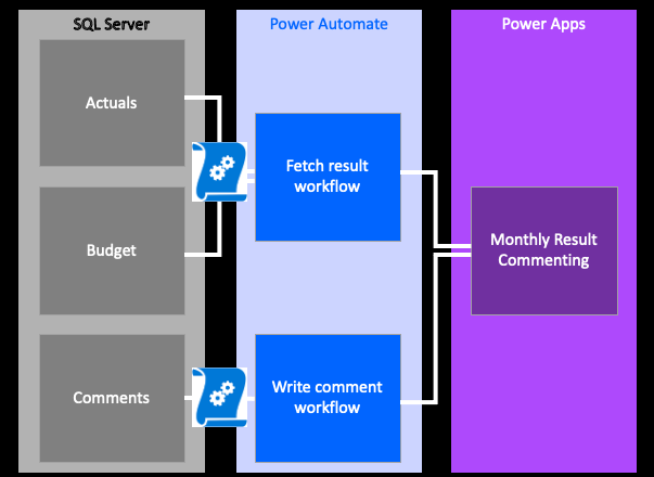
The example architecture, with three sources, two stored procedures and two related flows
Our application will have three tables, and will fetch and write to the underlying data tables through running Stored Procedures with Power Automate.
The Fetch Result workflow will combine the budget and actual tables, delegating some of the calculations to SQL Server through the stored procedure. The output will then be stored as a Collection in the app.
The Write Comment workflow will look at an input box within the application, and submit this (together with some meta data) as a new row into the Comments table.
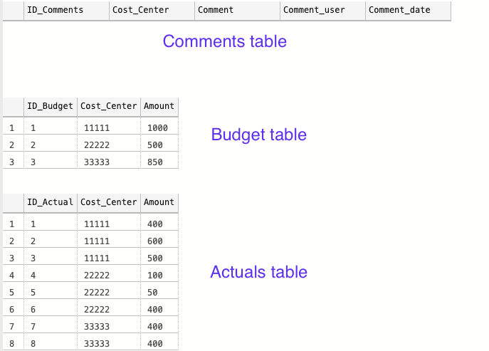
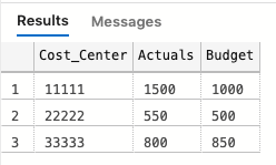
The tables look as follows:
The three tables for our example
The Comments table is currently empty, and the Actuals and Budget tables have some values that will give some kind of variance to comment on.
Setting up the application
Skeleton of the application
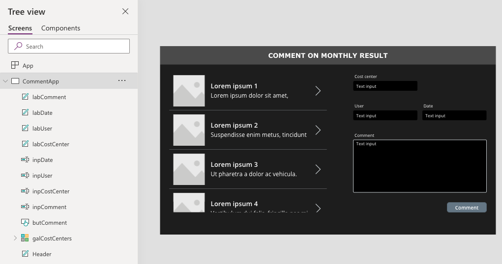
The application that I’m building for the example will have the user choose a cost center and then comment on it. For simplicity, it will not show previous comments or any other functionality – only create a new row in the comments section.
The Cost Center, User, and Date input boxes will be filled based on the Gallery Selection, logged in user, and today’s date, respectively. So the user will only have to fill in the comment section, and click the Comment-button.
Writing the Stored Procedures
Let’s start with fetching the data. I’m thinking that a good set-up could be to let SQL join the Actual and Budget tables into one, and calculate the variance for us, and then send a summarized table to the Power App. As the example business grows, a single cost or revenue center could have plenty of transactions, and it’s better to delegate the calculations to SQL Server.
So the output that we want should look like:
Table to import to the app
The data that we have in the Actuals table has several records, while the Budget table seems aggregated, meaning that we will have to create a temporary table that summarize the Actuals-amounts on Cost centers, and then join the two tables. Here’s the code:
-- SQL example code --
-- Create a temporary table to store the summarized transactions in
CREATE TABLE temp
  (
     cost_center CHAR(5),
     actuals     INT
  )

-- Populate the temporary table with the summarized actuals per cost center
INSERT INTO temp
SELECT cost_center,
       Sum(amount) AS 'Actuals'
FROM   dbo.actuals
GROUP  BY cost_center

-- Join the temporary table with the Budget table on Cost Center
SELECT a.cost_center  AS 'Cost_Center',
       Sum(a.actuals) AS 'Actuals',
       Sum(b.amount)  AS 'Budget'
FROM   dbo.temp AS a
       LEFT JOIN dbo.budget AS b
              ON a.cost_center = b.cost_center
GROUP  BY a.cost_center

-- Remove the temporary table
DROP TABLE dbo.temp
Now, we want to create a Stored Procedure out of this. A Stored Procedure is some SQL code that you save in your database, that can be called upon to be executed. It can have various results. If the SQL code is an Insert Into type of query, the result is a new row, and if the code is a Select-statement, the output would be a table with the defined rows and columns.
Power Apps cannot itself call upon a Stored Procedure, but Power Automate can. Hence, we can trigger a workflow in Power Automate with a Power Apps button, and execute the Stored Procedure as defined.
Once you have your SQL code (I have mine posted above), it’s easy to create a Stored Procedure. Just add
CREATE PROCEDURE procedure_name
AS
sql_statement
to your query. As illustrated in the first picture, I will need two stored procedures, one for fetching the data and one for adding the comments. So with the Fetch Results example above, you would add as follows:
CREATE PROCEDURE fetch_results

AS

-- Create a temporary table to store the summarized
CREATE TABLE temp
  ... (see full statement above)
For the procedure where we want to insert values into a new row in the comments table, we first need to define the parameters (which we will ultimately will extract from the Power App) and then make a Insert Into query that makes good use of those parameters.
The SQL code will look something like:
-- Create the stored procedure to write comments in Comments table
CREATE PROCEDURE Write_comment
  -- Define the needed paramenters to insert
  @inp_Cost_Center  CHAR(5),
  @inp_Comment      CHAR(200),
  @inp_Comment_user CHAR(100),
  @inp_Comment_date DATE
AS
    -- Code to insert the selected parameters into respective column
    INSERT INTO dbo.comments
                (cost_center,
                 comment,
                 comment_user,
                 comment_date)
    VALUES     (@inp_Cost_Center,
                @inp_Comment,
                @inp_Comment_user,
                @inp_Comment_date)
After running those queries, the two Stored Procedures has been saved to our database, and we can call upon them by writing
-- Run procedure to get results data
EXEC fetch_result

-- Run procedure to insert new comments
EXEC write_comments
   @inp_cost_center = '11111',
   @inp_comment = 'Example comment here, up to 200 chars',
   @inp_comment_user = 'Karl-Johan',
   @inp_comment_date = GetDate()
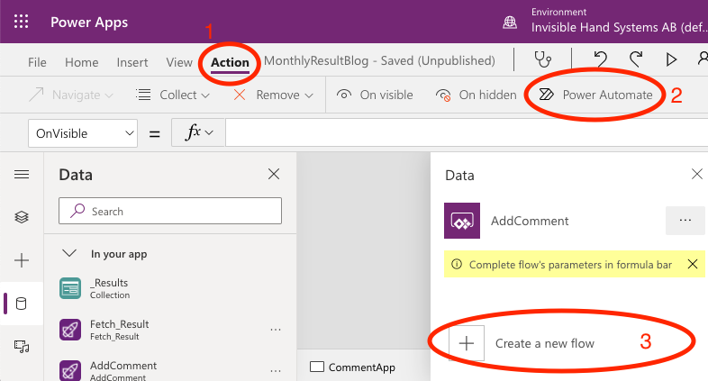
Next we have to create a Power Automate workflow that we can trigger from the app that executes the Stored Procedures as we want them.
You can start creating your Flow from within Power Apps or from the Power Automate website, depending on your preference. In Power Apps, you find it in the Action ribbon, to the far right as Power Automate.
Launching Power Automate within Power Apps
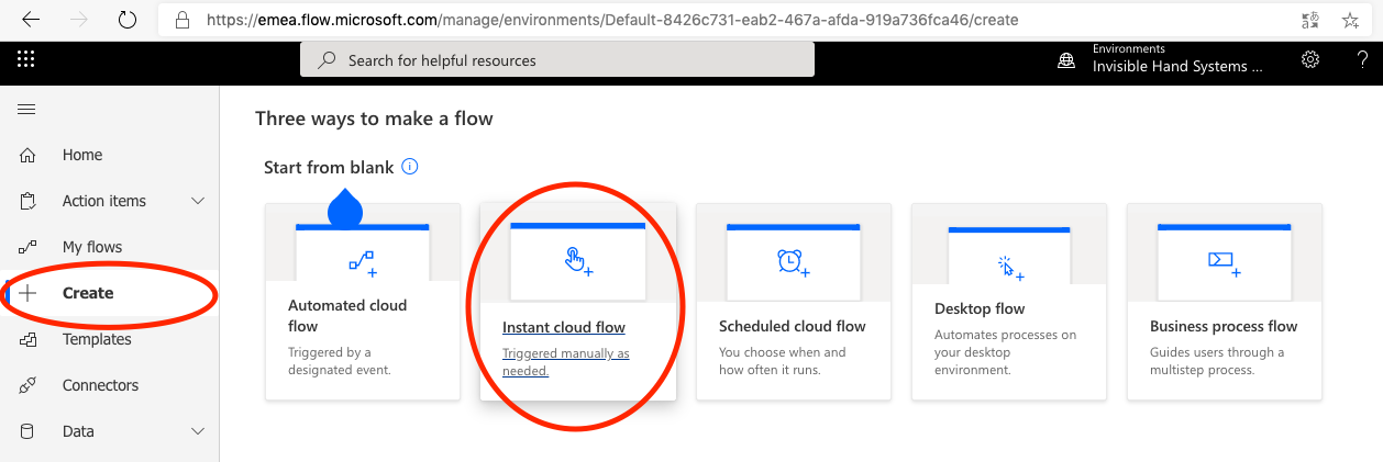
Second, we want to create a blank flow, that is triggered by Power Apps (it can either be triggered by a button or something like OnVisible).
Creating a blank Flow
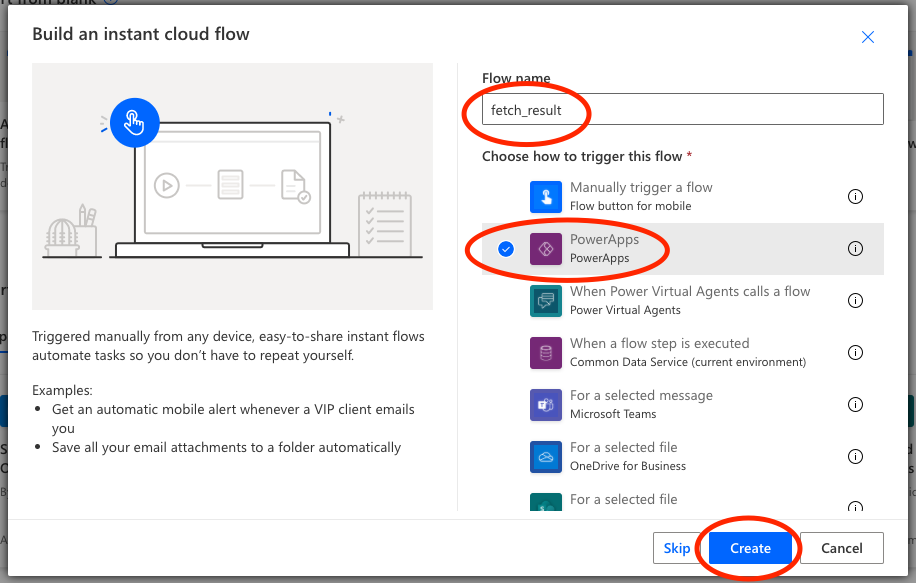
Name the Flow and choose Power Apps as trigger
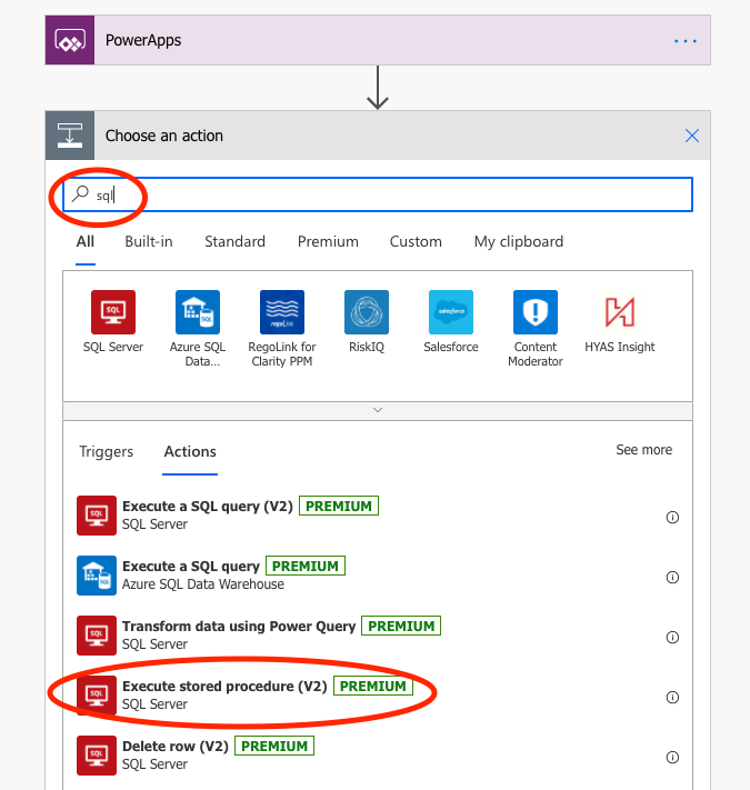
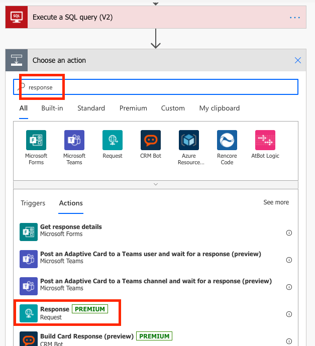
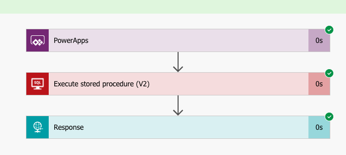
If you have choosen the Power Apps trigger, you will get that as an initial step in your Flow. Our flow will consist of three steps: the Power Apps trigger, a step called Execute a Stored Procedure (V2), and finally a step called Response that sends the output from the Stored Procedure back to the Power App.
Start by adding the steps: you find them by searching for SQL and Response respectively:
Search for SQL among the tasks, and choose Execture Stored Procedure (V2)
Search for ‘Response’ and choose the action
Let’s start with configuring the Execute Stored Procedure (V2) step. You choose the applicable settings for the database where you ran your Create Procedure script. I didn’t find my database at first, but you can switch connection in the three dots in the top right hand corner of the action. Then choose the database and the Stored Procedure that you have created. All is fine and dandy!
Second, let’s configure the Response step. This is a bit more technical, and if you get stuck, check out Brian Dang’s video for further clarification.
The Response action creates an output from the flow based on a JSON-script. But you need to help it along a little bit to tell it how it should interpret the script.
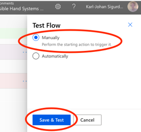
Once you have added the step, start by saving the Flow, and then run Test in the upper right hand corner of the screen (next to the Save-button). Then choose to trigger the Flow manually, and then Save & Test.
We will perform the test with a manual trigger
The Test-procedure will check your connections and such, and if all looks well there, you get to Run Flow. It should go smoothly, so when you click Done, you should end up with something a little bit like:
A successful test.
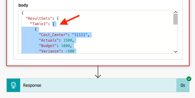
Click on the Execute Stored Procedure (V2) step, to expand the output. If you scroll down a bit, you get to see the Body output. Copy the text within the outer bracket [, i.e. exclude the first ResultSets and Table1. Make sure not to copy the closing curly brackets } in the end of the text relating to ResultSets and Table1.
Copy the text within the body section within the outmost straight bracket [
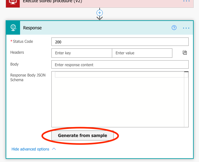
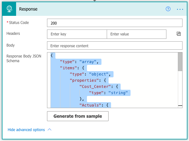
Go back to Edit mode of the flow. Open up the Advanced Options in the Response action, and click Generate from Sample.
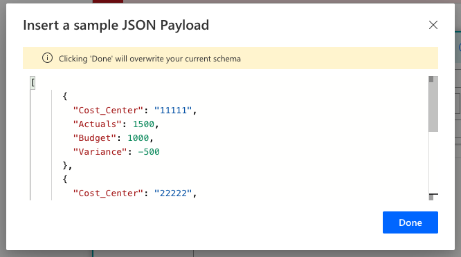
Paste the sample text from the Test-output that we copied earlier, and click Done. You will get an autogenerated Response body schema.
Paste the sample text and get an autogenerated schema based on the sample data
You can have a look through the code to see that it makes sense, for example that the column types are correct.
Ensure that the column typs are correct. For example, do we want Cost_Center to be of type ‘String’?
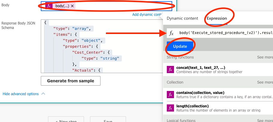
That sets the skeleton for the output. Now we need to tell the Response function how we’d like this data to be presented to our Power App. This is done in the Body-section of the Response action. Put the cursor in the Body-section, open up the Expression section, and enter the code below. Then click Save or Update, and you are good to go!
Enter the expression for what output we’d like from the Response action
The second flow is simpler, as it only contains two steps: the trigger and the Execute Stored Procedure V2-action. You may of course want to expand on this in a real application, but in the example, simply entering the data into the Comments table will be sufficient.
So precisely as in the steps described before, set up the Execute Stored Procedure V2-action, with the Write_Comments procedure.
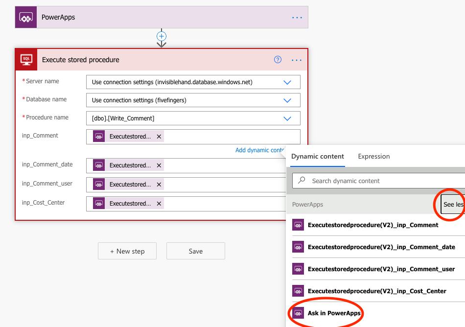
Just one additional thing. Remember how we defined a bunch of parameters in the SQL query. Here, we have the opportunity to tell Power Automate where to fetch information for those parameters. For all of them, we want to ask in Power Apps what the information should be.
To do that, you put the cursor in respective field, and click on See more under Dynamic Content, and select Ask in Power Apps. Do this for each parameter.
Select “Ask in Power Apps” for all parameters.
Save, test, and done! Easy peasy.
Now the components are in place for the application. So let’s have a look at how we can connect the Flow to the application.
Connecting the Power Automate Flow and making your application work
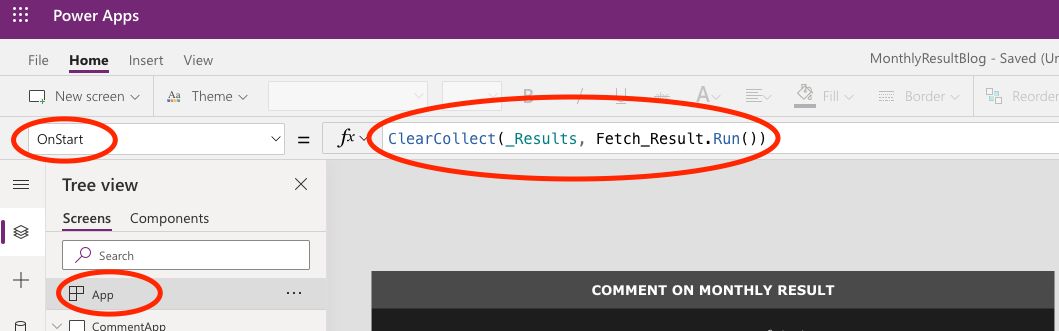
Let’s assemble the parts we have created in our app. Firstly, we need to do something with the data that we create in the fetch_results stored procedure. In order to work with it, let’s load it in a Collection when the application starts.
Select the App in the Tree View, and then select the OnStart property. Here, you can tell the application what to do as it starts, and you can simulate starting the app by clicking on the three dots next to App in the Tree View and click Run OnStart.
To create a Collection upon launching the app, use the ClearCollect function. I’m calling my collection _Results, and I’m loading it with the table that is the output from the Fetch_Result Flow. Hence, the code is:
Configure your app to run the Fetch_Result upon launching
As the output from Fetch_Result is a ready table, and the Flow does not require any parameters, we don’t need to do anything else. The data will load, and we can use _Results as the Item-property in the gallery we created.
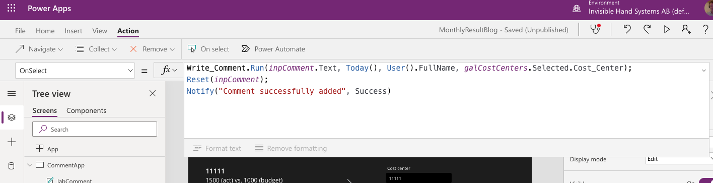
The Write_Comments Flow requires some more input. We need to tell it where to find the information it will enter in the various columns. The names might be a bit bulky, but you should be able to make out which parameter is which. In the example, the code for the OnSelect property of the button I added is:
So I take the comment from the inpComment input box, the date is the current date (the output from the Today()-function), the commenting user fetches the full name from the currently logged in M365 user, and the cost center comes from the selected cost center in the gallery.
I added some more code to Reset the comment box upon completion, as well as send the user a small “hoorah” for submitting the comment
The user can now see the condensed results in the gallery, and create records in the Comments table, just as we wanted them to be able to.
There are several directions into which we could improve the example app. We could add row-level security, so that the users only could comment on their cost centers, by passing a user group parameter and filter the results table on that parameter. Or we could fetch and show the latest comments in the comments table, and maybe edit them directly. The SQL Stored Procedure methodology supports (maybe even simplifies) this type of development. And the data stored in the app is fit for purpose, and the data source is better protected at the same time.
Despite the title, this is not a sci-fi post. However, if you are new to data modeling and Power BI, it may seem futuristic to you.
In this post, I will explain the concept of star schema data modeling and it’s related concepts dimension- and fact tables. Setting up a smart star schema design will make your data exploration and dashboard building so much easier. In order to do that, we need to know what fact- and dimension tables are and how they are intended to be used.
What do we mean by fact- and dimension tables?
When I started out with data modeling in Power BI, the hint to make a distinction between dimension and fact tables was exactly the type of hint I discarded as too technical and complicated and not necessary for what I wanted to build. It’s neither of those things. Using a star schema data model is easier from a user perspective, and almost always applicable.
Instead, if I would have invested a few minutes into understanding why a data model is different and (sometimes) better than my Excel spreadsheets, it would have saved me a lot of time down the line.
So let’s start by having common terminology.
A dimension table is a table about something that we want to explore. As an example, a dimension table can tell you about an entity’s place in a hierarchy, group together a handful of entities, or relate a date in a longer timeline.
A fact table contains occurances of the things we want to explore. Each row contains information of a single event or transaction, that is further described in the dimension tables.
The fact table contains information that is unique to the transaction, while the dimension table holds information that is shared and compared.
Take a financial model where we want to track actuals on a P&L based on data from our accounting system. The fact table would contain each transaction made in the accounting system, maybe one row per journal entry. We could perhaps store information on the amount, the currency, the cost/revenue center, the date, the counterpart, and the account of the transaction. All things unique to the transaction.
What’s not unique to the transaction is how an account relates to the CoA hierarchy – which accounts sums up to which P&L-row. Or which counterparts that are preferred suppliers and which that are secondary or worse choices. This type of information is suitable in a dimension table.
Why should I build a star schema?
Increase performance – reduce data
If you only have one fact table, your model could just be one wide (with many columns) table. But this may be a bad idea, despite being a fully functional solution. That’s because using dimensions may drastically reduce the data in your model.
Let’s expand on our P&L-example. Let’s say we have 1000 transactions on 10 different accounts. We can either put the sum-level information in the fact table, or in a related accounts dimension table. If we put the information in the fact table, we need an additional column with information for all transactions. That’s 1000 additional cells of information. Instead, if we have a table with the sum level for each account and relate the fact- and the dimension table on the account key, we only get 10 new rows – one for each account. Consider that your data sets may grow to millions of rows, and you’ll start to understand why smart data modeling is key for dashboard performance.
Avoid many-to-many relationships
If you have multiple fact tables that you somehow want to compare, you need to use dimension tables to avoid many-to-many relations. Power BI allows for many-to-many relations, but it’s clearly stated that if you don’t fully understand how these relationships works, you risk getting erroneous output.
In our finance example above, one may argue that actuals without context is useless. Perhaps you want to compare the actuals to a plan or a budget. This plan is also suited for a fact table, as it contains information across multiple dimensions – maybe a forecasted outcome for an account on a cost center a given month.
If we want to compare actuals to the plan for an account on a cost center, we need to tell Power BI how these relate. If we make a direct relationship between the cost center column in the plan-table and the actual-table, we will get a many-to-many relationship, and likely get outputs in the dashboard that are wrong. But the cost centers in both tables relate to the same cost center hierarchy, where each cost center only occur once. So we can put this hierarchy as a dimension table, and let both fact tables have many-to-one relationships to this dimension table. Then, Power BI knows how the two fact tables relate to each other, and we can add additional information to the dimension table like sum-levels or cost center owners with little additional data.
Suite yourself
Now, the applications and underlying data always varies. These best practice rules may very well be too generalized for your specific problem, so the star schema may not work for you. But you should know the rules and know when you deviate from them.
How do I build a star schema?
If you want some practical tips on how to transform your data to a star schema data model, I’d recommend the video below from Guy In a Cube. It also shows hands-on on how to use the Power Query functionality in Power BI which I always recommend to use.
Power BI Tutorial – From Flat File to Data Model
Summary
Smart data modeling will always make your dashboards faster and easier to work with. Moreover, if you are using multiple fact tables, dimension tables almost becomes a necessity.
When building a star schema, you have fact and dimension tables. A fact table contains transaction-specific information, and a dimension table contains information common for a certain aspect of multiple transactions.
Even though star schema modeling is best practice, your specific needs may require something else. However, you need to know the rules to break the rules.
One can easily build a star schema data model from a single flat file using the Power Query Editor functionality in Power BI. A great way to improve efficiency of your dashboards by reducing data, and simplify development by having clearer tables.
The primary strength of Power Apps is how easy it is to build very robust solutions with few internal weaknesses. This is both in part secured and threatened by a concept called Delegation. You will likely encounter delegation warnings early on as you start building canvas apps. Here’s why they occur, what they mean, and how you can work around them.
Thank God for delegation!
Generally speaking, delegation is when you pass something from an entity to another. Specifically for Power Apps, it means passing the task of calculation to the data source, rather than fetching the full dataset and calculating it within the app. This to help make your app fast and efficient, even though you are using large underlying datasets. By delegating queries, you limit the amount of data and calculations within the app.
By moving the processing of the data to the data source, our apps can be made faster. But in order to do this, we need to be able to tell the data source what we mean when we write Power Apps syntax, in it’s own language. Microsoft provides a list of delegable functions, which is continuously extended.
What does delegation warnings mean?
So what does it mean when the blue double-underlines and warning triangle pop up?
Delegation warnings marked with a warning triangle and blue double-underline
Since there’s not a 1:1 match between what the Power Apps language is intended for and what the data source is intended for, there are things the Power Apps language can do that the data source is not suited to do. Operations and functions that cannot be delegated to the data source gets a delegation warning.
A delegation warning means that the operation is only evaluated on the first 500 rows of the dataset, that is loaded and stored into the app. There is a possibility of extending this to 2000 rows, but this slows down the app and will pose the same problems as your dataset goes beyond 2000 rows.
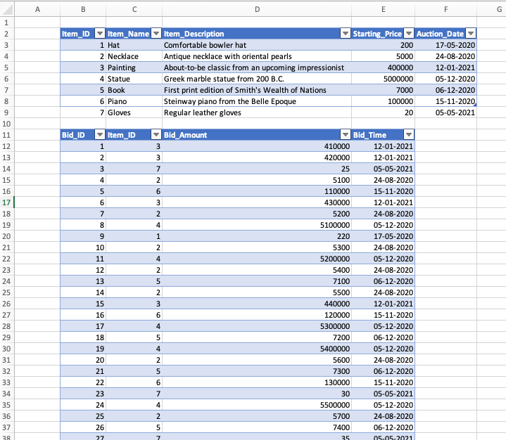
As an example, let’s say you have a 500+ rows dataset where you store data for an auction. We store data for the auction item in a ItemTable and the information about bids on the items in a BidTable, as below:
Two tables for an auction app
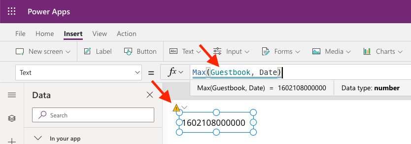
There’s an auto-increment on the Bid_ID, so in order to get the current highest bid for an item, we try to filter the BidTable on Item_ID and MAX(Bid_ID).
But MAX() is not a delegable function. So if our BidTable is larger than 500 rows, Power Apps will only look at the top 500 rows it loads, and take the maximum value out of those rows, and not out of the full data set, potentially showing a lower highest bid.
A data set like BidTable is likely to grow beyond 500 or 2000 rows as the app continuous to be used, so using non-delegable functions here is not a robust solution. It will work against smaller datasets that are certain to not exceed 500 or 2000 rows, but you must be aware of this limitation in case specifications change going forward.
There’s a workaround for our Max-function in the bidding example, so we can make it robust beyond 500 or 2000 rows. Let’s say that we want to show the current highest bid in a label called labHighestBid, for a selected item in the gallery galAuctions. When we try to use the Max-function as follows:
What’s going on here? The calculations that we are asking the data source to perform, is to give us a filtered table of all the rows that has the Item_ID that we have selected in the Gallery, sorted by the numeric column Bid_ID. Then we take the top record, and extract the Bid_Amount information from that record.
To make this work, you can define this variable OnVisible for the relevant screen, as well as OnSelect in the galAuction gallery (so it updates when you select a different item.
The reason why delegation does not work in most cases, is because the formula is trying to evaluate something in the data source out of a row context in Power Apps. This creates a lot of network chatter, with information for each row going back and forth between the app and the data source.
Take our bidding Max-function example. The way it would evaluate what the maximum Bid_ID is for each item, is to filter and evaluate the BidTable again and again for each row in the Power App. We would send as many queries to the data source as there are rows in the Power App.
The proposed workaround sends a request to the data source that does not change with the Power Apps information. It asks for a singular Item_ID to filter the BidTable on, and asks it to sort it nicely for us (things that both e.g. SQL Server and Sharepoint is capable of doing). And from that, we extract the top value, which we know will be the maximum value. The workaround does the max-calculation within Power Apps, as it evaluates the whole filtered dataset, so it will fetch all the rows that match the filter criteria from the data source to the app, potentially making it slower.
Summary
Delegation speeds up our apps by asking the data source to conduct the calculations on their end instead of within the app, but all functions aren’t delegable.
If a function isn’t delegable to the data source, the Power App developer will receive a delegation warning. This is a problem for datasets larger than 500 or 2000 rows, where the information shown may be incorrect if delegation warnings are ignored.
When you encounter a delegation warning, there’s usually a workaround to your problem, such as importing a filtered data set into a variable and conducting the calculation within the application.
Even though we believe data and data models should be managed in robust cloud based environments using Power BI and Power Apps, we all come across times when a specific data task needs to be handled quickly. For many of us Excel will then be the tool we turn to.
Unfortunatly many still view and use the tool based on its traditional features and many of the newer and more powerful features are overlooked. E.g. Power Query and Power Pivot.
In the ‘Get & Transform Data’ group under the ‘Data’ tab you will find the same Power Query tools as in Power BI desktop, providing a nice familiarity between the two tools.
However, as you might know, Excel’s basic spreadsheet size is limited to 1,048,576 rows. Most times, this is probably enough, but increasingly often we need to work with larger datasets, even for ad-hoc work. Of course, we could adjust our SQL query to reduce the number of rows. But if we are still exploring the data it can be really useful to utilise great Excel features like pivot tables.
Enter Power Pivot. This is the feature that allows you to work with millions of rows of data in Excel. It has the same infrastructure (Vertipaq) and design as the Table and Model views in Power BI desktop and allows for creating measures and calculated columns/tables with DAX just as in Power BI. (Unfortunatly the design interface is a little bit older and lacks things like IntelliSense when designing DAX formulas.)
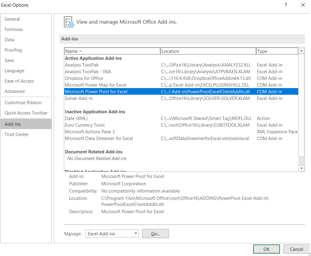
To start using Power Pivot, first ensure it’s enabled in under Excel Options:
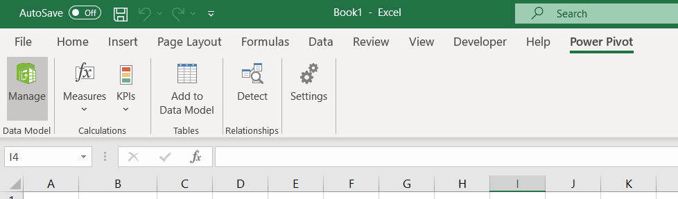
It will then be available under its own tab in Excel called ‘Power Pivot’
From here you can add tables already in the excel file to the Power Pivot data model, but then we would be limited to just above 1 million rows per table.
The trick is to load the external data directly to the Power Pivot data model, without loading it into an excel table.
There are two ways to do this, either from inside Power Pivot or by using Power Query.
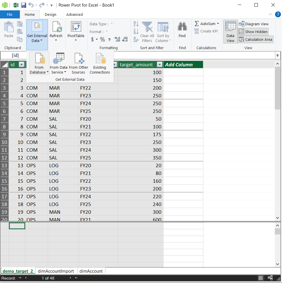
To load the data through Power Pivot, press ‘Manage’. From the new window that pops up it is easy to find the buttons needed to retrieve data from a database
Recognise the Table and Model buttons at the bottom right from somewhere else?
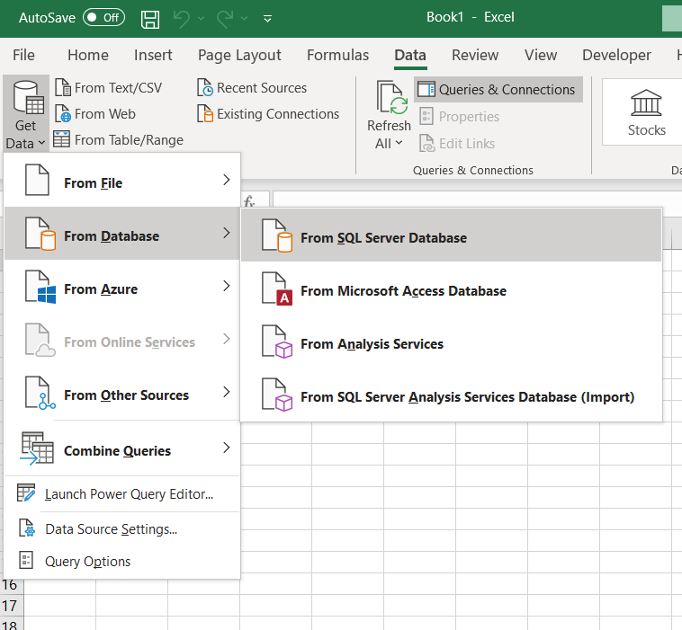
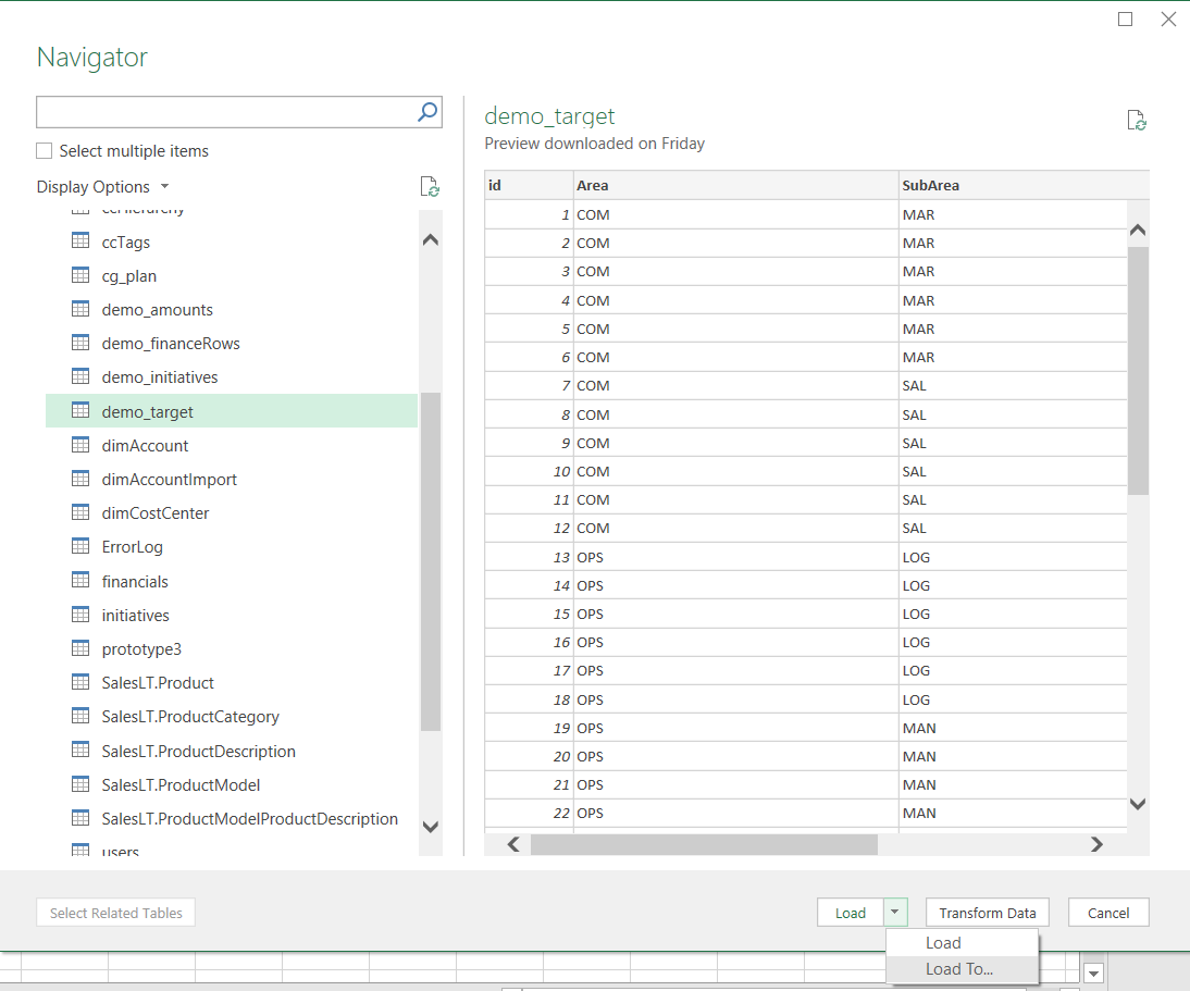
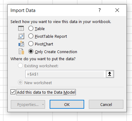
Alternatively you could achieve the same result by using Power Query. First, go to ‘Get Data’ in Excel:
Then log on to your database and choose tables to load. Then click on ‘Load To…’
Then import to ‘Only Create Connection’. Avoid the other options as these would load the data straight into Excel, activating the row limit. Remember to tick the box to add this dara to the Data Model.
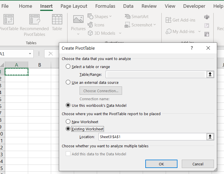
By retrieving data in either of these ways (they are fundamentally the same) you will be able to load millions of rows into the data model and then view this data in Excel using a pivot table.
After the data is loaded, insert a pivot table anywhere in Excel and choose the data model as source:
Remember that the row limit will still apply when drawing up a pivot table, so don’t add all the fields to it at once.
If you are considering whether or not to automate that recurring process that you or your team need to do every now and then, this post could be intended for you. Maybe you have never automated anything before, and daunted by the upfront investment in time and resources, you simply don’t understand how a robot can outperform your skilled team to the degree where it would be worthwhile. Then this post is certainly intended for you. Here’s an explanation of why robots are better.
The robot lawn mower
Mowing the lawn can be a deeply satisfying act of garden work. It can also be a real burden, keeping you from more important things like hanging out with friends and family, or simply enjoying a cold beverage in the shade. For those times where lawn-mowing is a burden, humanity has developed mechanized and motorized lawn-mowers, that garden owners push and pull across their lush front- and backyards. The motorized mowers require some degree of human steering, and human operators maneuver their tools with impressive skill across the lawn, cutting an even and neat surface that feels great below our bare feet.
Lately, a new player has emerged on the rural and suburban lawn scene. A mindless little box, endlessly pacing across the lawn, seemingly not doing anything. But the lawns that they inhabit are flawless, and the robot lawn mower is here to stay.
One of many robots that will shape our future (lawns)
Worse execution, better result
John Henry beat the steam drill, and any human operator would beat the zig-zagging of a robot lawn mower. The human moves deliberately and methodically across the lawn, with evenly spaced lines to cut the grass as resource efficient as possible. The robot? It rolls straight, bumps into something, turns a little and rolls on until it bumps into something else. No method, no care for efficiency, just mindless rolling. Still, the lawns cut by robotic lawn mowers are flawless, usually much more so than their manually mowed peers.
Methodical but manual will always lose to manic mowing
This is because the robot’s stamina is infinite. It does not long for socializing with family or cold beverages. It mows the lawn, it’s all it cares for. Some models run back to their charging stations every now and then, only to be able to get back out there. I have never met such a manic human gardener.
Since it can spend so much more time mowing the lawn, the robot does not need to be more efficient – time is on its side. Chances are its random bumps and turns will get to that patch it missed in half a day or so.
This is one of the great benefits of automation. Robots will never take a holiday or even a break – they will carry out the task you asked them to, every time you ask them, until that task is complete. The robot does not need to be more efficient than a human on a single occassion to be more efficient than a human.
New tasks, not no tasks
If the human lawn mower operator was only capable of operating a lawn mower, for some reason, his/her profession would be threatened by the emergence of a robot lawn mower. It’s likely the human operator would come up with reasons why a robot couldn’t mow their specific lawn, to justify their position. Fortunately, no or very few operators are only capable of operating a lawn mower. One or two things will happen, as the robot replaces the human operator:
Trimming and landscaping beyond the robot’s reach: there are always going to be tricky patches that the robot for one reason or another cannot reach. Areas that the operator now can tend to with great care, as the robot takes care of the easy bulk work.
Maintenance and repair: the lines that outlines the area that the robot should cut must be the most fragile thread known to humanity. I believe a robot lawn mower owner spends as much time repairing broken lines as they previously did mowing the lawn
The tasks of a robot owner becomes more qualified and the overall result is better
Here, you may stop and think wait a minute, if I’m still cutting the tricky parts and spending as much time on maintenance, what’s the point? Remember that these tricky parts previously did not receive as much attention, as your attention was split on the easy and the hard parts. Some were perhaps overlooked. And remember that the robot mows your lawn better than you do, over time. So you are spending the same time on more qualitative tasks, with a much better result. That’s the point.
Upfront investment
Now, a robot lawn mower is a luxury beyond most people’s budget. Similarly, RPA has until recently required a very high technical knowledge, too cumbersome for most professionals to attain and too expensive for most organizations to profit from. Power Automate fundamentally changes that. Available in most M365 plans, it’s easy to get started with automating tiny administrative tasks with pre-built schemas, and easy to get hooked to keep expanding the applications in your own, your team’s, and your organizations processes.
In defense of lawn-mowing
Finally, as a person who finds great satisfaction in the smell of freshly cut grass, and methodically tidying up an overgrown lawn, I must speak out in defense of lawn-mowing. Processes that some find tedious, may be rewarding for others. Focus on automating the processes that does not develop your ability of performing your key tasks, and that you don’t find rewarding. It’s likely that you have a buffet of administrative tasks that can be automated. Start with the ones you don’t like, so you can spend more time doing things you like. Maybe hang out with family and friends, enjoy a cold beverage in the shade, or mow the lawn.
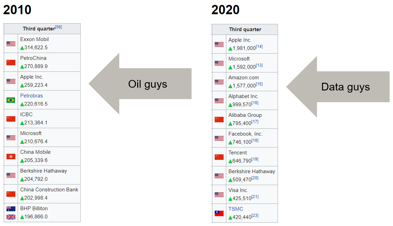
It’s fascinating how very quickly most of today’s tech giants have moved from start-up’s to world domination (see image below of largest market cap companies 2010 and 2020).
A few years ago the Economist published an article describing the similarities between this development and the growth of giant oil companies during the earlier part of the 20th century. The main topic of the article is how to ensure a competitive market. But it is interesting to note that this time the hot new commodity (data) is an abstraction created by humans, not a natural resource such as oil. Let’s hope that means resource scarcity will be less of a problem and that data can be a source of prosperity all over the world. In other words, you or your company probably have access to unique and valuable data. Try to make use of it.
In order for people to adopt your Powerapp, you need to pay attention to the design and user experience. Apps with few bells and whistles are easier to understand, and focusing on alignment, relative styling, screen transitions, and notifications will help you build a good-looking application. But sometimes, you may want to add that little extra to your app to make it look professional. This post details how you can use a timer to animate objects in your app.
The timer object
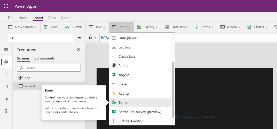
You can access the timer object from the Insert Ribbon, under Input controls. It appears as a button-like object, with the text 00:00:00 (corresponding to hh:mm:ss).
Timer object is found under Insert > Input > Timer
The timer has a few key concepts that makes it really useful.
AutoStart/AutoPause: Decides whether the control automatically starts/pauses when the user navigates to/from the screen that contains the object.
Duration: The maximum amount of milliseconds the timer can count to. Maximum value is 24 hours, and default is 60 seconds.
OnTimerEnd: Tells the application how to react when timer reaches the duration-time.
Repeat: Boolean for whether the timer restarts upon timer end
Start: Boolean whether the timer starts
The last function requires some further explanation. This is the function that we can use to trigger the timer from another control, say e.g. a button. In order to do this, we have to use a context that takes a boolean (true/false) value.
The following example sets up the context _timerStart in OnStart for the screen that has a timer and a button to start and pause the timer.
//Set up the context in OnVisible
OnVisible = UpdateContext({_timerStart: false})
//Code the button to alternately start and pause the timer
OnSelect = If(_timerStart,
    UpdateContext({_timerStart: false}),
    UpdateContext({_timerStart: true}))
//Set the Start-function on the Timer to fit the context
Start = _timerStart
How it looks when you activate a timer from a button
Moving objects with timer
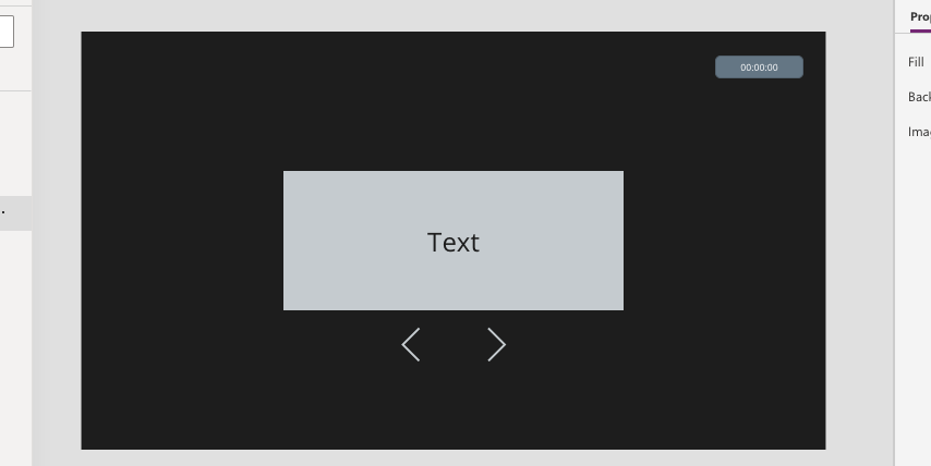
Let’s say that we want a label that we can turn like a page, by clicking a Next-button below. We want to label to disappear to the right, and then a “new” page to enter from the left.
Add three objects to a new screen: one label that we will move, and two buttons that will move the label to the left or right (I have used the ChevronLeft and ChevronRight icons in this example). Lastly, add a timer object.
Format of my example objects
To make the object move left or right, we can change the X-property of the label, which defines how many pixels from the left edge of the screen the object starts to form. If you want to place the object in the center, you can use the following code:
X = Screen1.Width/2 - Self.Width/2
Decomposed, this first puts the left edge of the object in the center of the screen, then moves it half the length of the object’s width further to the left.
This is static, which is a good place to keep it when we’re not clicking buttons. To make it move when we click a button, we must set the X-property relative to the Timer’s value.
Start with setting the Duration of the Timer, which in this example will determine how long the animation will take. I will use 600, i.e. 0,6 seconds. Make sure the AutoStart-property is set to false.
If I click the right button, I would like the label to swoosh out over the right edge, and then reappear coming in from the left. And vice versa for the left button. We will hence have three stages for the label: stationary, going out right, and returning from the left. To facilitate that, we will have an If-statement, the following states
//Not yet functional IF-statement for Label X-property
X = Screen1.Width/2 - Self.Width/2 +
If(
Timer1.Value > 0 && Timer1.Value <= 300, //Out right func.,
Timer1.Value > 300 && Timer1.Value <=600, //From left func,
0)
Here, I want to send my regards to the PowerApps-team here for allowing for Elseif-gates in the If-fuction, so that we don’t need to work with a bunch of nested If-functions. Note that when Timer1.Value = 0, the align-center function is default.
To make the label move from the center to the left, we want X to go from [Half screen width ] – [Half label width] to [Full screen width]. So we need to add [Half screen width] + [Half label width] in the time 0ms to 300ms
//Adding the function to add [Half screen width] + [Half label width] over 300 milliseconds to above If-statement

X = Screen1.Width/2 - Self.Width/2 +
If(
Timer1.Value > 0 && Timer1.Value <= 300,
   (Screen1.Width/2 + Self.Width/2)*(Timer1.Value/300),
Timer1.Value > 300 && Timer1.Value <=600, //From left func,
0)
As Timer1.Value goes from 0 to 300, the factor (Timer1.Value/300) goes from 0 to 1, which will uniformly move the label to the left.
Once the Timer reaches 300, we want the right edge of the label to be just outside of the screen’s left edge, and then uniformly move in towards the center. So we need to start with X = – Self.Width as Timer1.Value = 300 and go to X = Screen1.Width/2 – Self.Width/2 as Timer1.Value = 600. Hence, the full function looks something like:
//Full function that moves Label to the right for the first 300 milliseconds, then in from the left for another 300 milliseconds

X = Screen1.Width/2 - Self.Width/2 +
If(
Timer1.Value > 0 && Timer1.Value <= 300,
   (Screen1.Width/2 + Self.Width/2)*(Timer1.Value/300),
Timer1.Value > 300 && Timer1.Value <=600,
   -(Screen1.Width/2 + Self.Width/2)*(1-(Timer1.Value-
   300)/300),
0)
The first factor will place the label outside the left edge of the screen as Timer1.Value = 300. The second factor will go from 1 to 0 as Timer1.Value goes from 300 to 600, moving the label uniformly to the center.
Finally, to connect this to the buttons below, set the ChevronRight-icon’s OnSelect-propert to a boolean context, e.g. _timerStart, and update the Timer’s Start-property to that context
//Making the ChevronRight-icon start the timer

//OnSelect for icon:
OnSelect = UpdateContext({_timerStart: true})

//Start for timer:
Start = _timerStart
In addition, change the OnTimerEnd-property for the timer to revert the boolean context back to false:
//OnTimerEnd for timer:
OnTimerEnd = UpdateContext({_timerStart: false})
The principles for making it go in the opposite direction are the same, and we can separate the two actions either by a context or with another timer. I think the context-solution is a bit more elegant, so I’ll outline it briefly.
Firstly, we add a string-context, e.g. _direction, that can take on the values left or right. The ChevronLeft-icon will change the value to left and the ChevronRight-icon will change it to right.
//OnSelect property for ChevronRight-icon:
OnSelect = UpdateContext({_timerStart: true, _direction: "right"})

//OnSelect property for ChevronLeft-icon
OnSelect = UpdateContext({_timerStart: true, _direction: "left"})
To move it in reverse fashion, the code will be:
//Full function that moves Label either to the right or to the left, and then enter from the opposite edge

X = Screen1.Width/2 - Self.Width/2 +
If(_direction = "right",
   If(
   Timer1.Value > 0 && Timer1.Value <= 300,
      (Screen1.Width/2 + Self.Width/2)*(Timer1.Value/300),
   Timer1.Value > 300 && Timer1.Value <=600,
      -(Screen1.Width/2 + Self.Width/2)*(1-(Timer1.Value-
      300)/300),
   0),
_direction = "left",
   If(
   Timer1.Value > 0 && Timer1.Value <= 300,
      -(Screen1.Width/2 + Self.Width/2)*(Timer1.Value/300),
   Timer1.Value > 300 && Timer1.Value <=600,
      (Screen1.Width/2 + Self.Width/2)*(1-(Timer1.Value-
   300)/300),
0), 0)
Microsoft is continously adding new AI functionality to the Power Platform. Here is a brief look on how to use the text analytics function to detect the language and overall sentiment in a body of text.
This can be very useful when analysing interactions with customers or suppliers, the mood among team members and company perception among financial analysts or in the media.
This function is part of Azure Cognitive Services so you will need to create an Azure account to try this yourself.
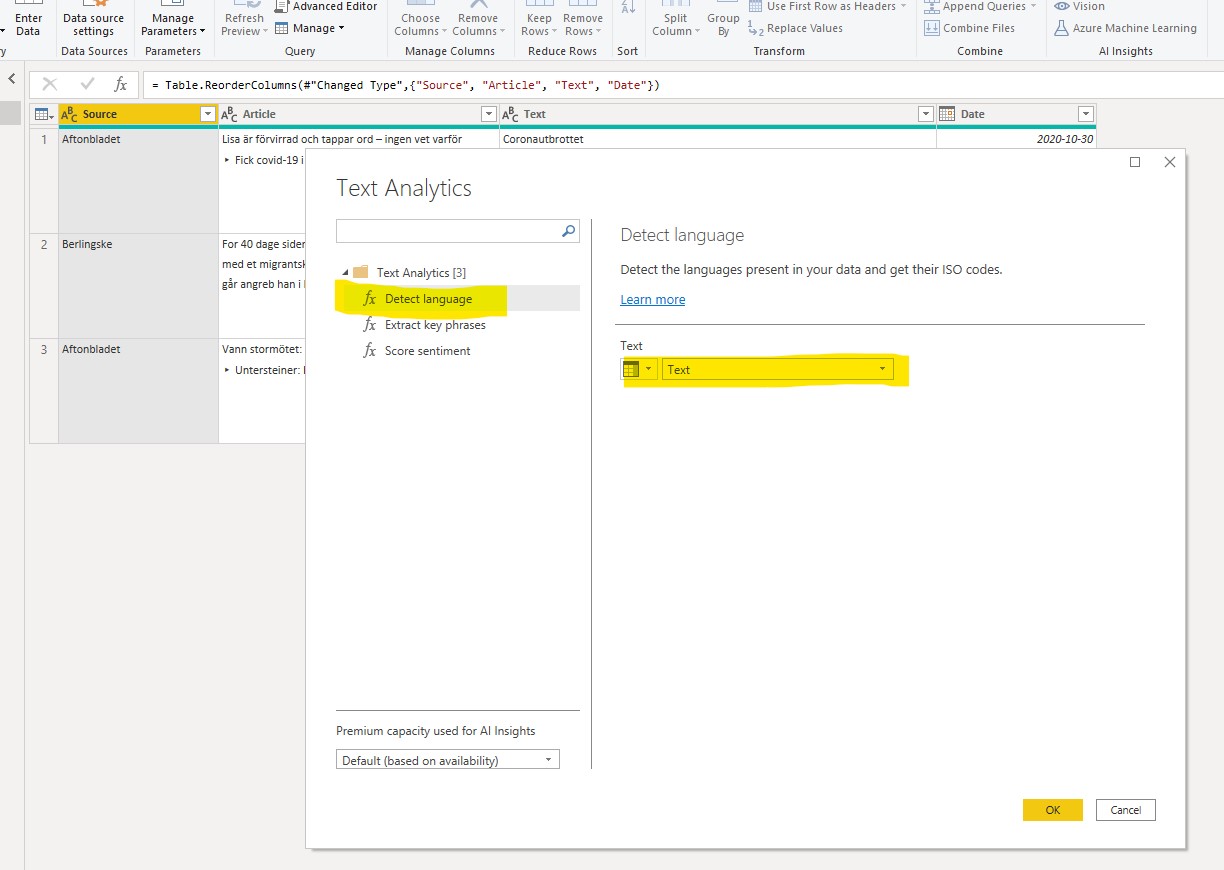
In the example below I am using a table with data about three newspaper articles. Two are in Swedish, one is in Danish. One of the Swedish articles is regarding a win in a horse racing event, the other is about the Coronavirus. The Danish article is about recent acts of terrorism in France.
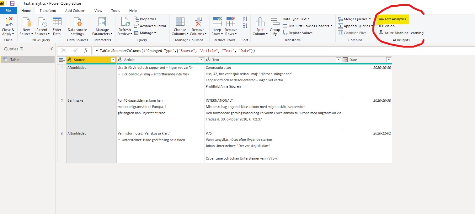
I have opened the Power Query Editor and marked out the ‘AI insights’ group under the Home tab. Today I am going to use the ‘Text Analytics” and the functions ‘Detect language’ and ‘Score sentiment’.
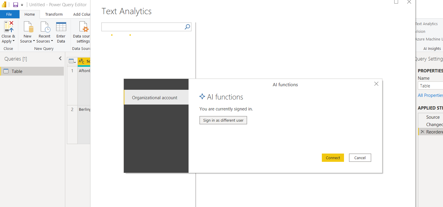
I am then prompted to sign in to my AI functions Azure account.
As the Score sentiment function is helped by pre-defining the language of a text, we will start with detect language. Simply select the column of the text you want do detect the language for.
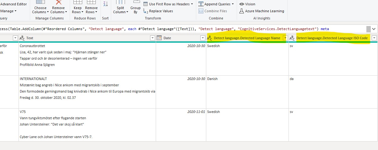
After a brief moment (larger tables will take longer time) two new columns are returned. The first shows the detected language and the second the corresponding ISO code for that language code for that language (this column will be used next in the ‘Score sentiment’ function.
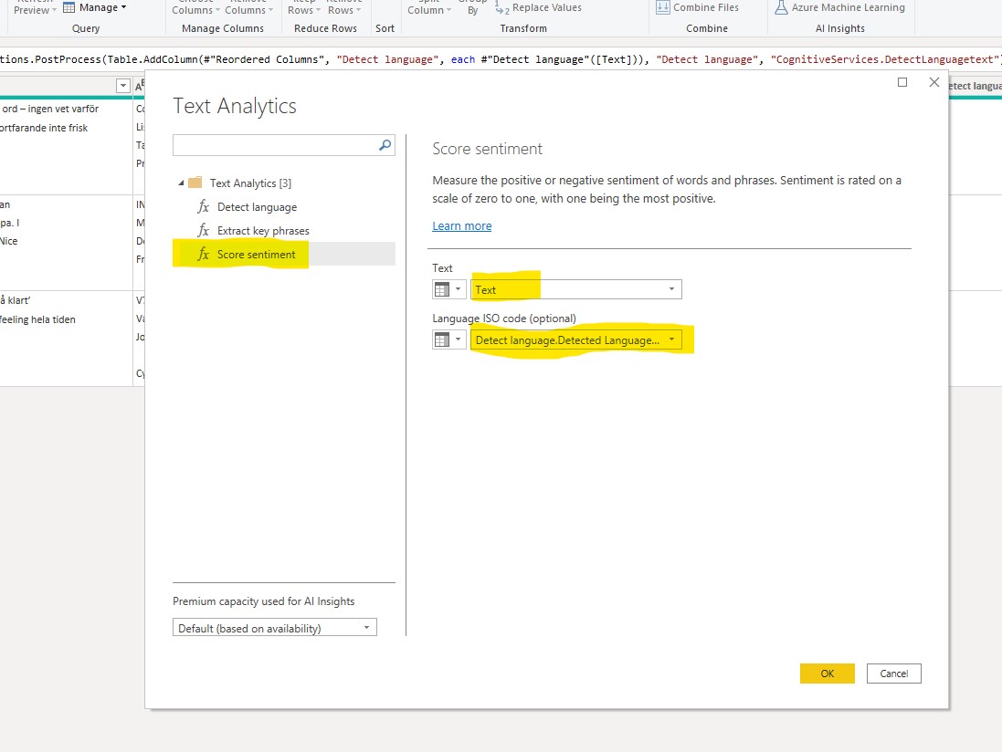
Now let’s try the ‘Score sentiment’ function. Choose the text column to analyse. As you can see there is an option to assist the model by providing a pre-defined language classification either as single two letter ISO code or as a column from the table. The second option is of course more useful if there are multiple languages in the table.
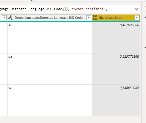
After pressing OK the function will return a new column with a score of the sentinment in respective texts. The score range is between 0 and 1, with 1 being the highest (most positive) sentiment. Usually most texts score between 0.4 and 0.6.
The results gave the article about horse racing the highest score (0.5366) and the article about the coronavirus the lowest score (0.4877).
Please note that the Danish article on terrorism is almost as high as the Swedish article on horse racing, whcih could seem counter-intuitive given the differing subject of the articles. I have also seen this pattern when using this function on other texts of different languages, where it seems different languages end up on their own language specific range, which differs from other languages. This it leads me to conclude that the function is not yet suited for comparison across different languages. However, it is very useful for comparison within languages and we can expect it will improve quickly over time.
For a detailed tutorial on the third text analytics function ‘Detect Key Phrases, check out this tutorial from Microsoft.